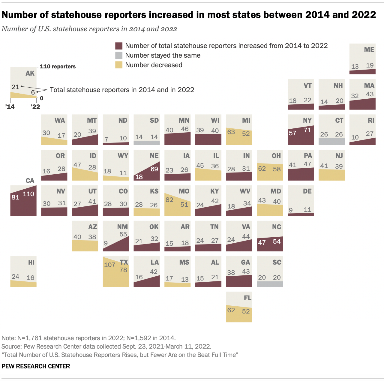
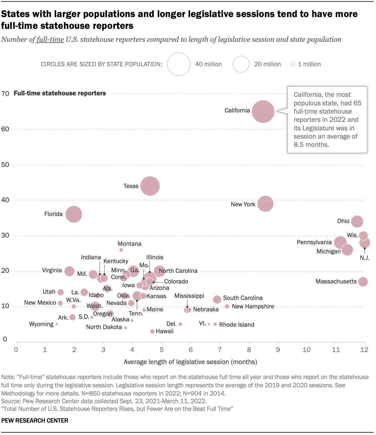
These are two graphics I made for Pew Research Center's report "Total Number of U.S. Statehouse Reporters Rises, but Fewer Are on the Beat Full Time"
This first is a scatterplot showing the relationship between the number of statehouse reporters and the length of each state's legislative session. It also uses bubbles to show the population of each state.
This second chart is a cartogram showing the change in the number of reporters from 2014 to 2022.